Role
Web Design, Infographic, Research
Timeline
4 Weeks
Tools Used
Brackets, Bootstrap 4
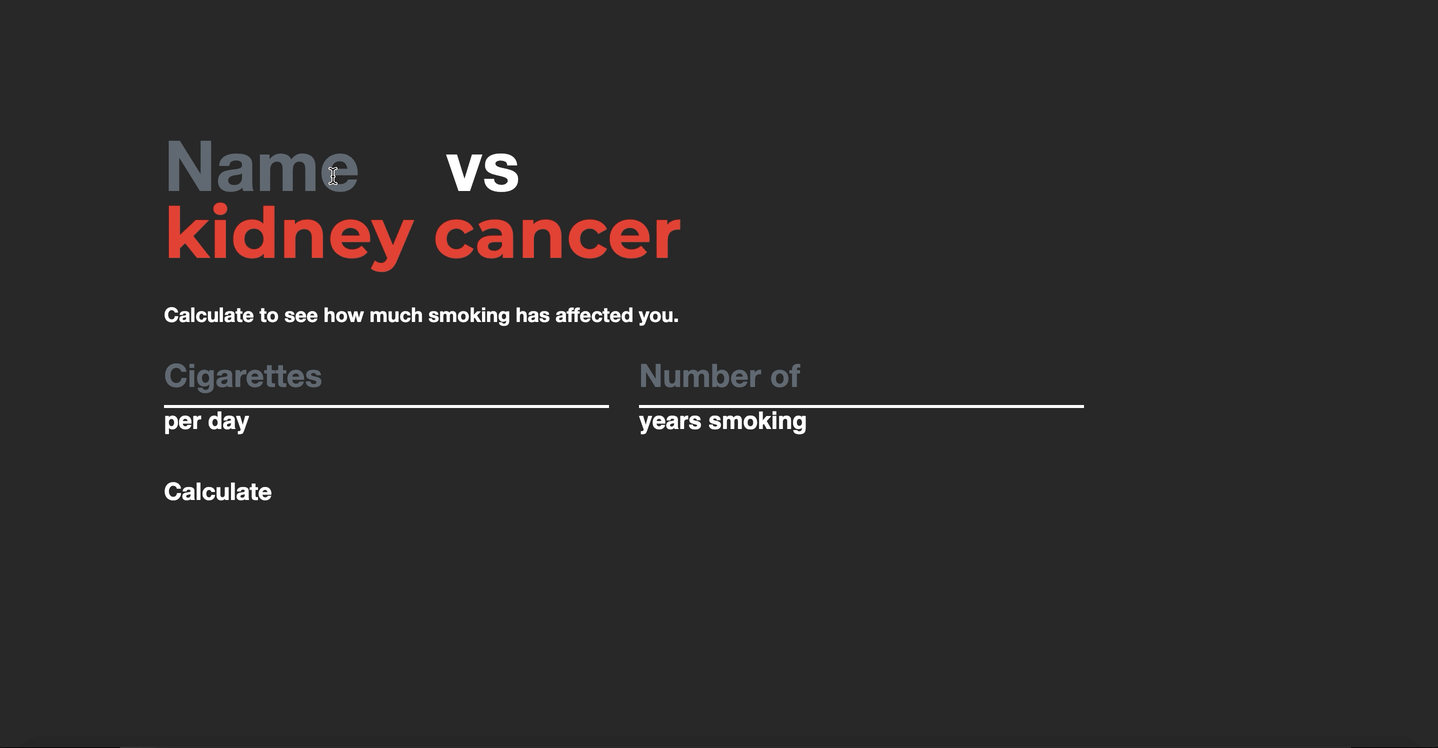
This website serves as a valuable resource for smokers. By simply entering their daily cigarette consumption and the duration of their smoking habit, users receive personalized statistics derived from these inputs. The aim is to empower users to consider quitting by presenting them with real-time data insights.
Design Challenge
How can I show extensive and personal data based on only two inputs.
Step three
Identify the User
This infographic is directed towards those who smoke and for those who live/deal with a smoker. This infographic can act as a way to get informed on how harmful smoking can actually be for you. Rather than just seeing random statistics, this website acts as a very personal way for people to see how they have been affected. By putting in real and personal numbers a person can judge themselves and hopefully strive to quit. This website therefore acts as a personal dashboard, where the statistics are tailored towards the user. The idea is that everything you need to know about your health in regards to smoking can be found here. This can act as a great resource to those who are trying to quit or those who see no reason to quit.
Step five
Conduct the Research
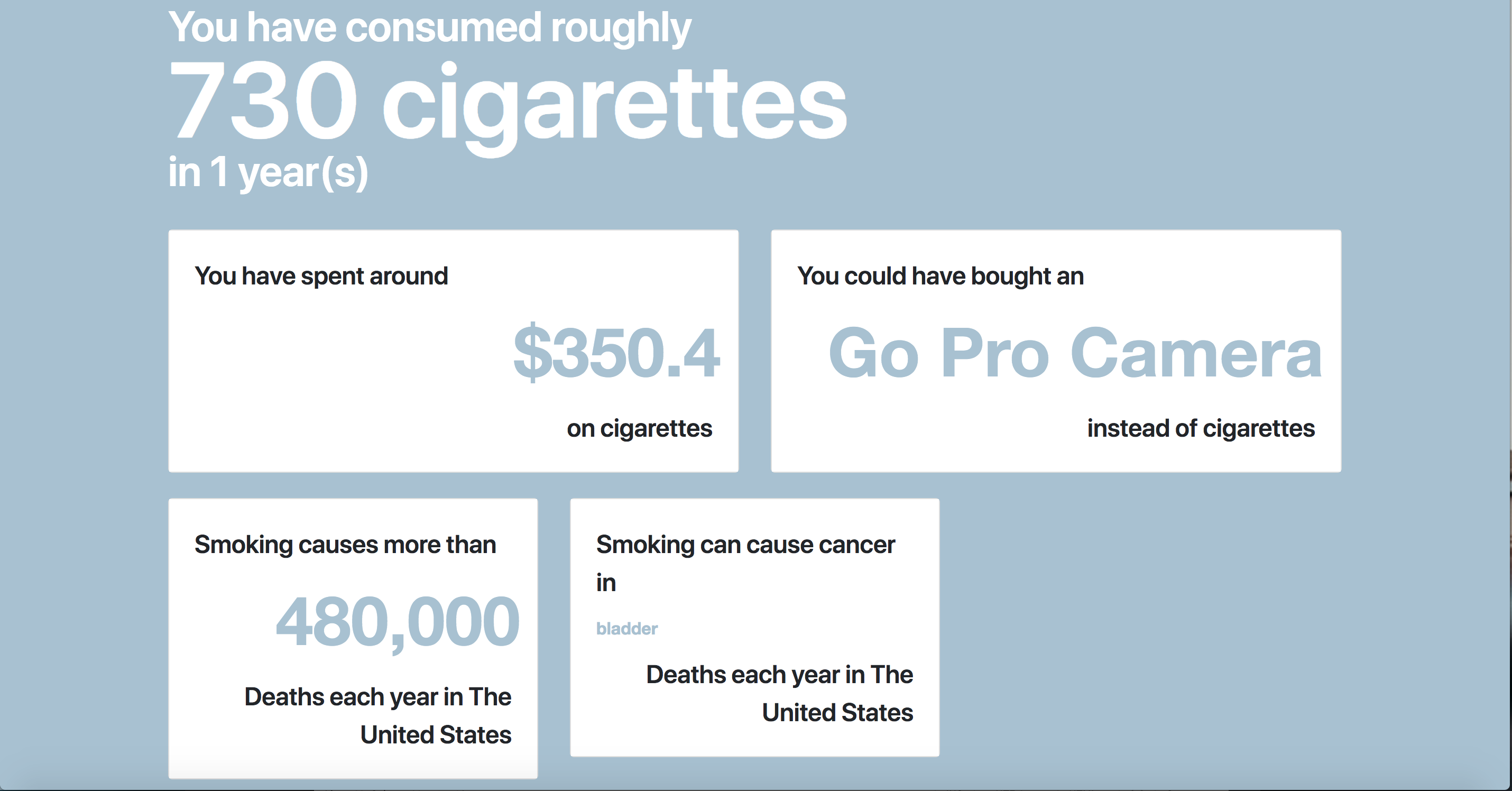
1 Cigarette is equal to 64 cents
1 Cigarette is equal to 11 minutes of your life
Lung cancer, oesophagus cancer, kindey cancer, pancreas cancer, stomach cancer, liver cancer, cervix cancer.
Cadmium is found in batteries
The title needed to change from a question to an input. That way the user could input their name and respectively see what they could be at risk for based on the rotating list of diseases.
I wanted to make the inputs very type driven, so I got rid of the boxes and changed them to lines. I also wanted the calculate button to act independently as a text object, because actually clicking the calculate button is not necessary when you can simply just press enter on your keyboard after inputting your numbers.
I originally started out with a light blue background with white contrasting type to create a cartoonish kind of feel. I ended up changing to a dark grey background so I could easily add the colour red to promote hierarchy. I used the colour grey to define the input fields that could be typed on, by doing this it helps to direct the user to type there without blatantly saying it.
User Testing
Dashboard
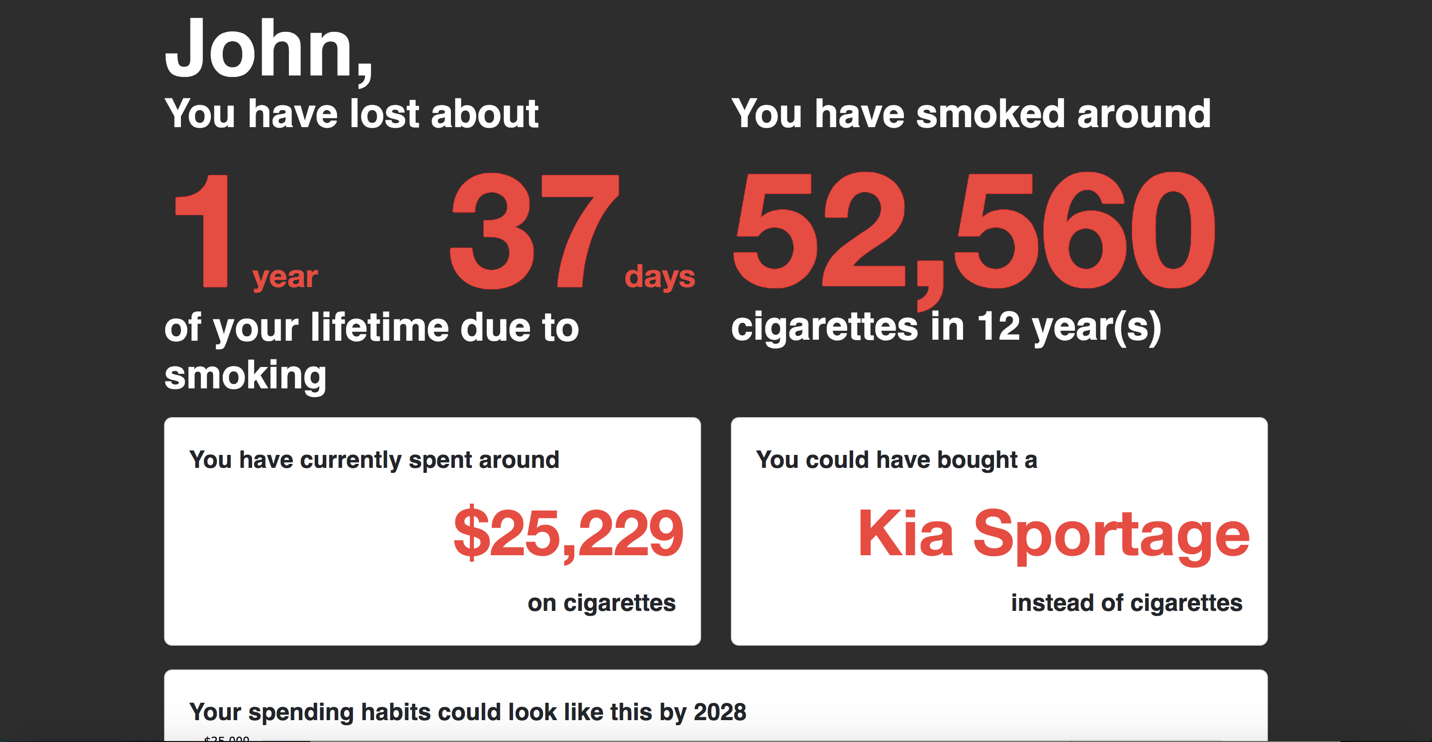
I had originally wanted to place the days lost as a direct result after the calculate input, and gave it its own screen. I did this to really draw attention to the days lost due to smoking as this is what I saw was the most important feature. The problem with this was that the link between “days lost” and the next page was lost and therefore was seen as two different things. To fix this I ended up putting the “days lost” statistic on the same page as the amount consumed, this way they would all act together and could function as a more useful dashboard because all the personal information you could need would be found on this one page.
The idea behind the card based layout for the other statistics was that if they we're cards they could essentially be added and removed. By using the cards I found that I would be able to add multiple statistics and keep them organized that way, as well as always be able to add more in the future. It would act as a hub for personal information based on statistics.
I changed the colour of all the results to red, as to distinguish and provide hierarchy among the other elements.
User Testing
Cigarette Anatomy
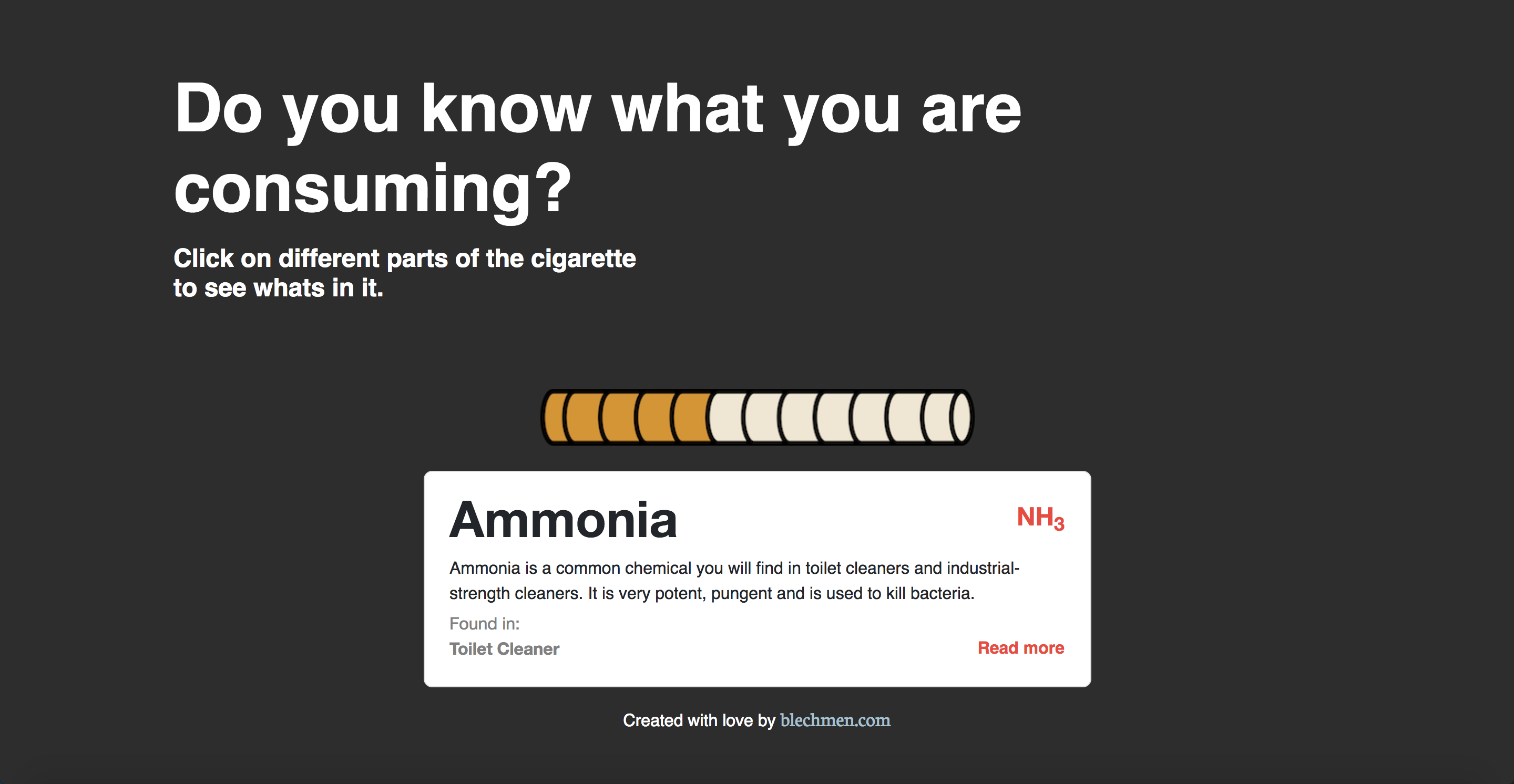
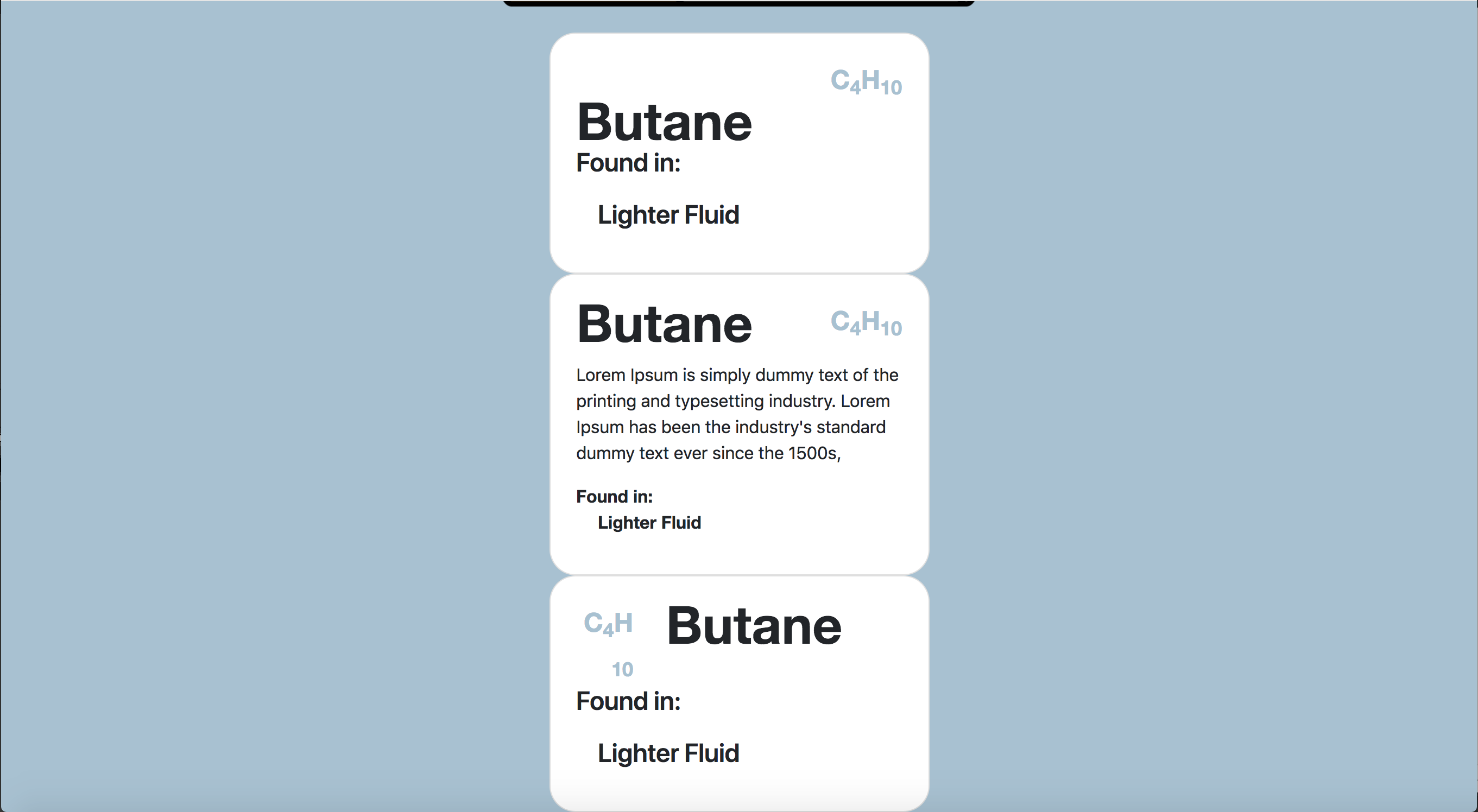
The title and the chemical codes needed to be able to fit on the same line so they can be visually linked together.
The "found in" part of the card was the most important part, because it acts as a way for people to really see what harmful chemicals they are consuming by smoking. I needed it to stand out but I still needed it to act well in a list. I ended up greying out the "found in" text in an effort to bring hierarchy back to the actual list.