Google Intern Challenge
Launch Prototype
Google Intern Challenge
Launch Prototype
Role
User Interface Design, User Experience, Prototyping, User Research, Project Management
Timeline
7 days
Team
Alex Blechta
Tools Used
Sketch, Overflow
Design an experience for new students to browse, search, and propose new student organizations.
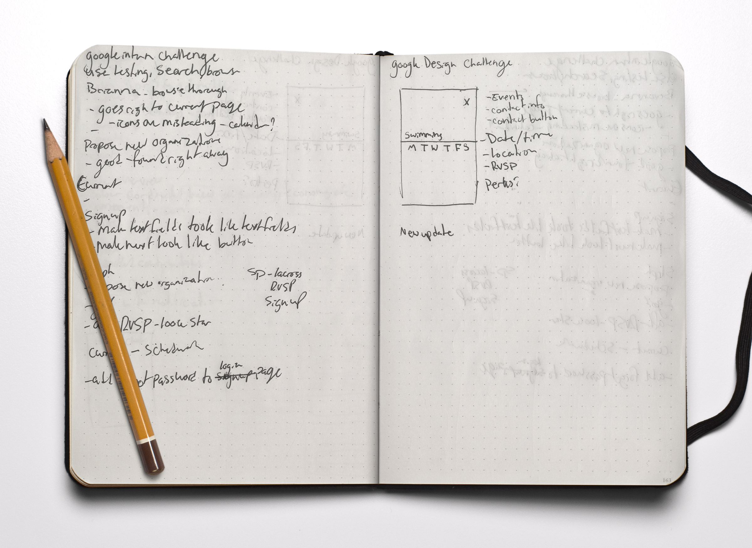
Step one
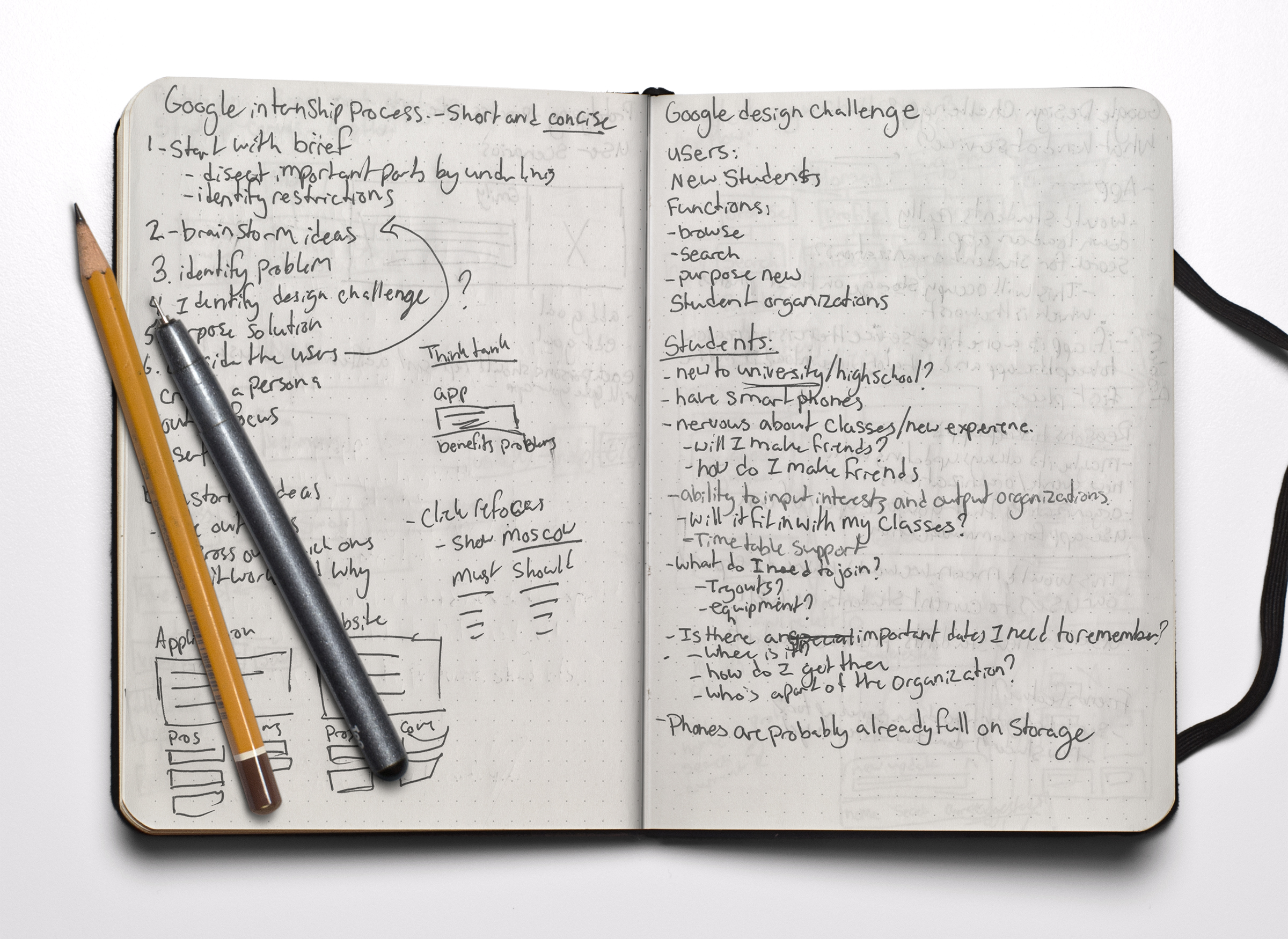
Identifying the Problem
Being a new student in university or college can be an incredibly intimidating yet equally exciting experience. The pressure to find new friends and join organizations on top of school work can add to a lot of stress. Finding these organizations and making sure they can fit into your school schedule can be a daunting task, and many don’t know where to start.
And along came my design challenge....
How might I design an application that will be simple and stress free for new students to find and suggest new student organizations on campus?
Step two
Proposing a Solution
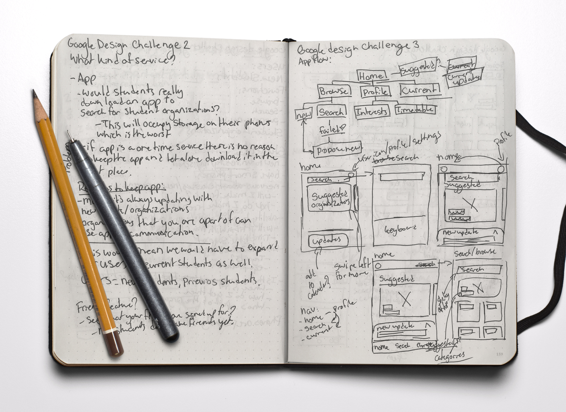
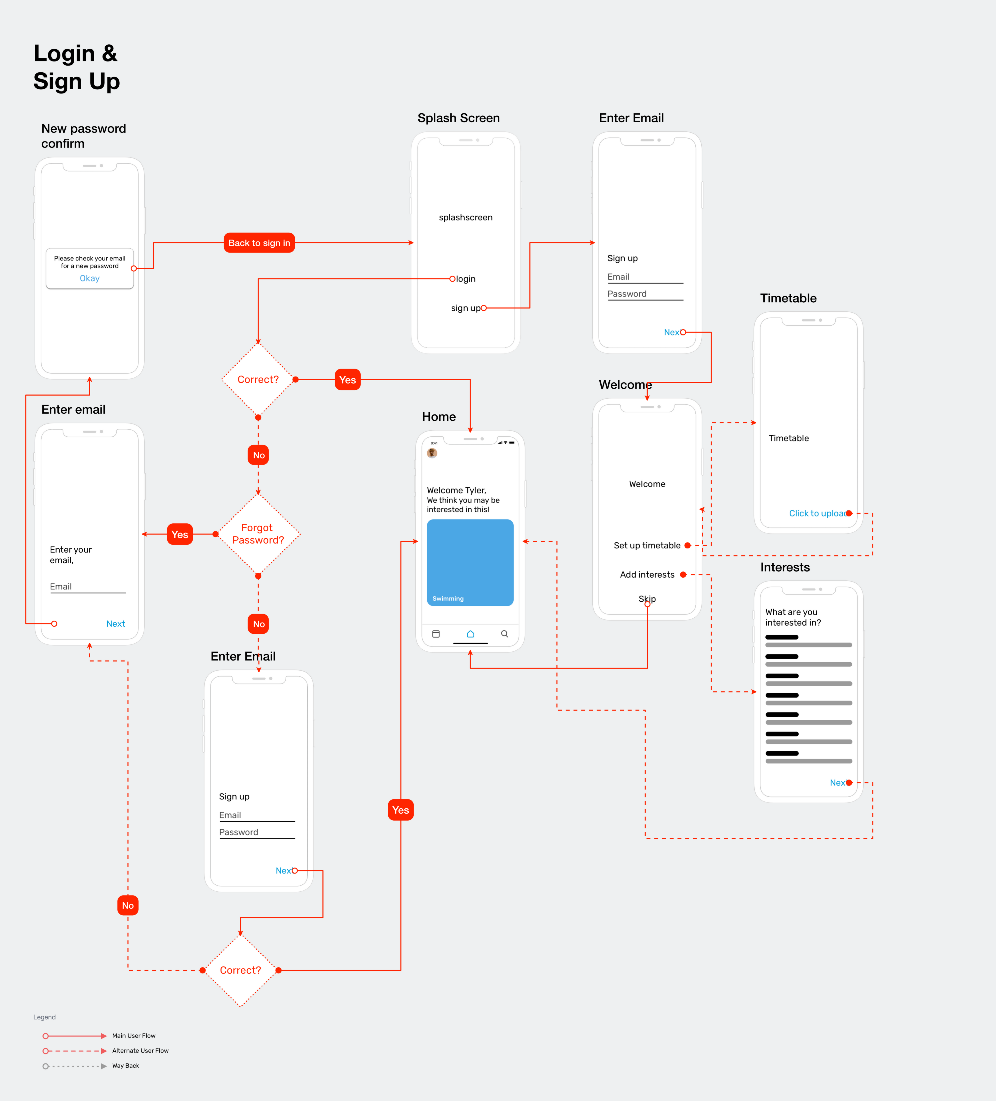
The solution I ended up with is a mobile application designed for new and current students to browse, search, and propose new organization ideas. Initially, the app was imagined with only new students in mind, and the features were essentially just a one time service. After doing research and looking into my users, I concluded that in order for an application to actually work with my users, it would need to have more features that would encourage them to keep using the app. This concluded that I needed to expand my user demographic to current students as well. Not long after oncampus was born…
Step three
Identify the User
The users that I will be focusing on are new students that are enrolling in classes and have a desire to be get involved through joining extra curricular’s and student organizations. These students are new to university life and have little to no idea of what life on campus is actually like. These students are often very nervous about making new friends and trying to fit in.
Step four
Create a Persona
Tyler is a new student starting at York University in the fall. In high school, Tyler was on the swim team and was able to balance and handle the stresses of class and practice everyday. He was aware that there was a swim team on campus at York but had no idea who to contact about it. Besides swimming, Tyler is also interested in finding out what other activities he can join that will fit into his timetable.
Step five
Establish a Focus
Browse featureMy next design challenge appeared
Which experience would work best for my users?
The features presented in the brief alone determine that this app would act as a one time service which is fine for our new students audience. But would students really keep an app, let alone download one in the first place if its features only provide a one time service? Students already have trouble with storage space on their phones, so the incentive to download and keep the app is not there. To provide more incentive, more features would have to be added and the target user would have to expand.
A website would work as a one time service kind of experience, which would be great for the new student demographic. However websites are generally less personal and slow and tend to lack in services.
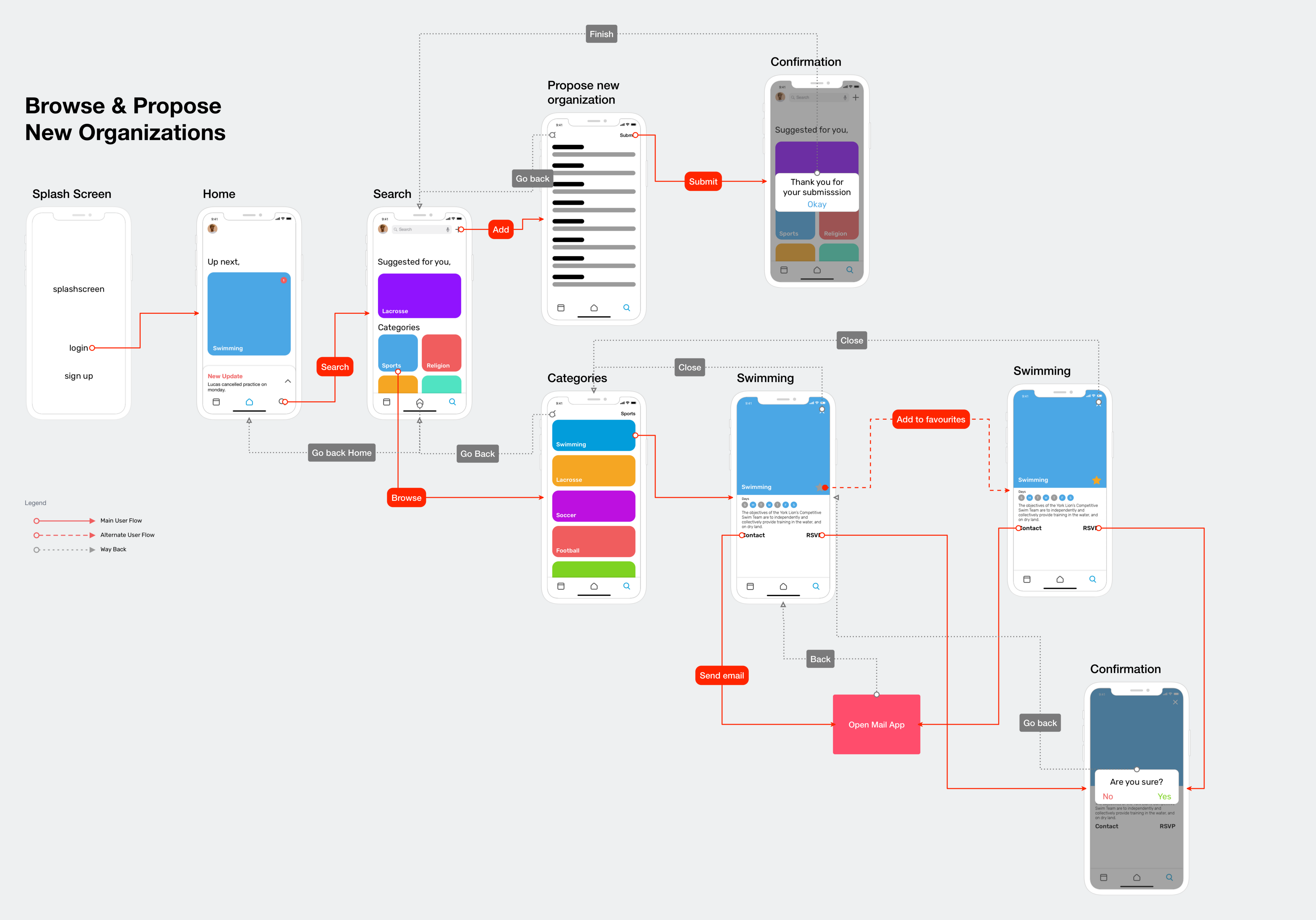
Scenario one
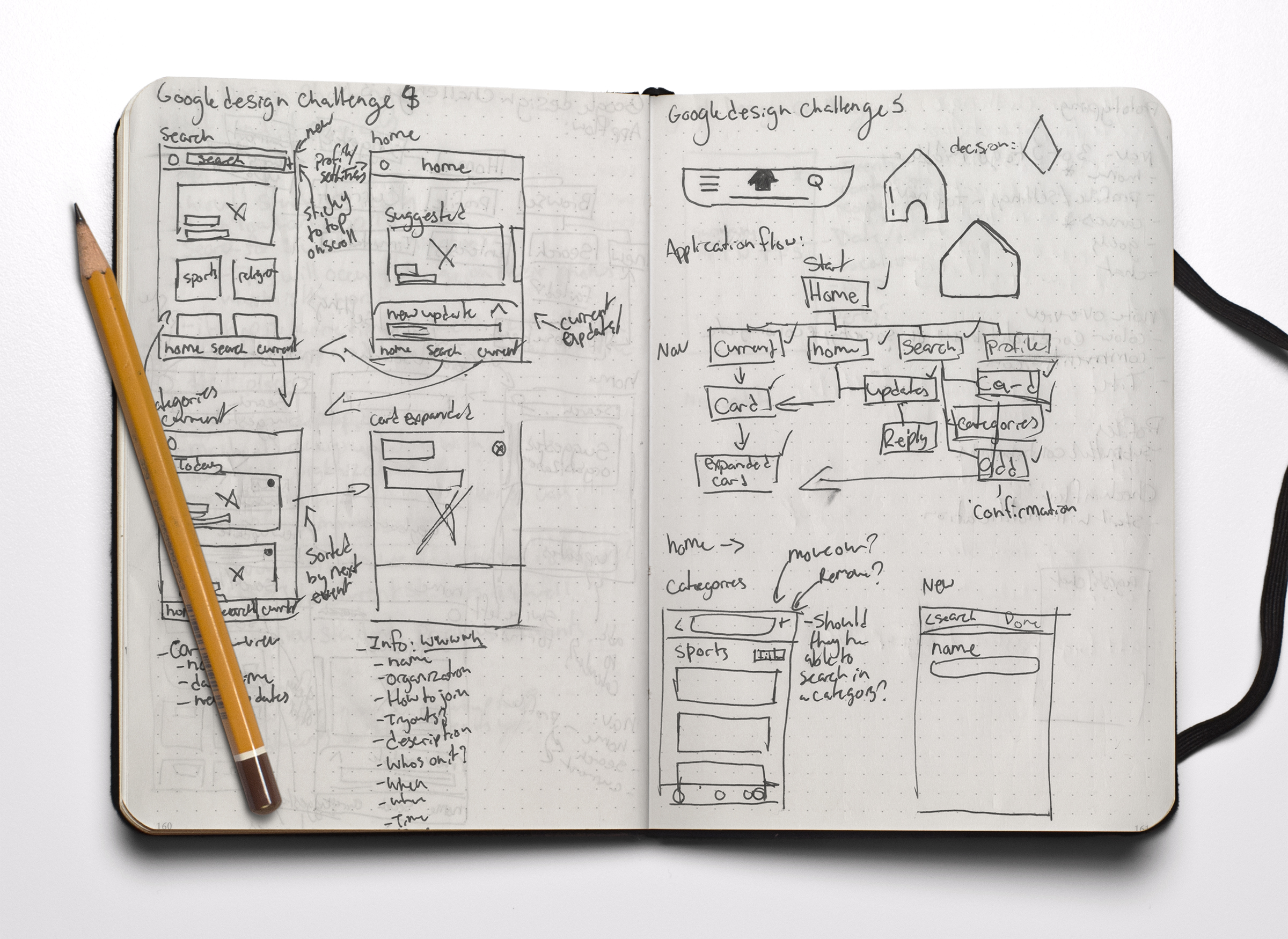
Browse & Propose New Organizations
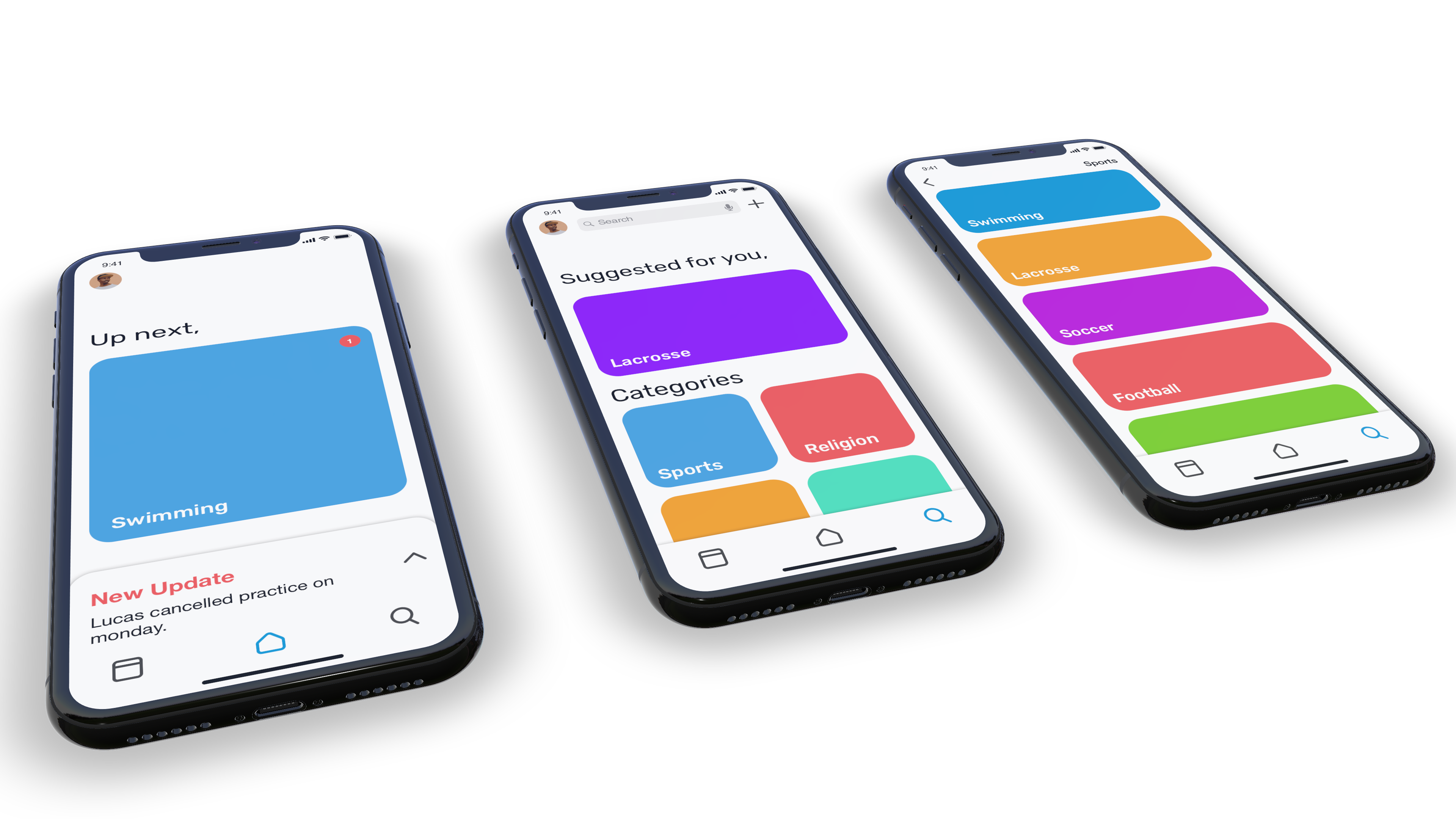
Tyler here is browsing through the sports categories and found swimming and decided to RSVP.
Scenario two
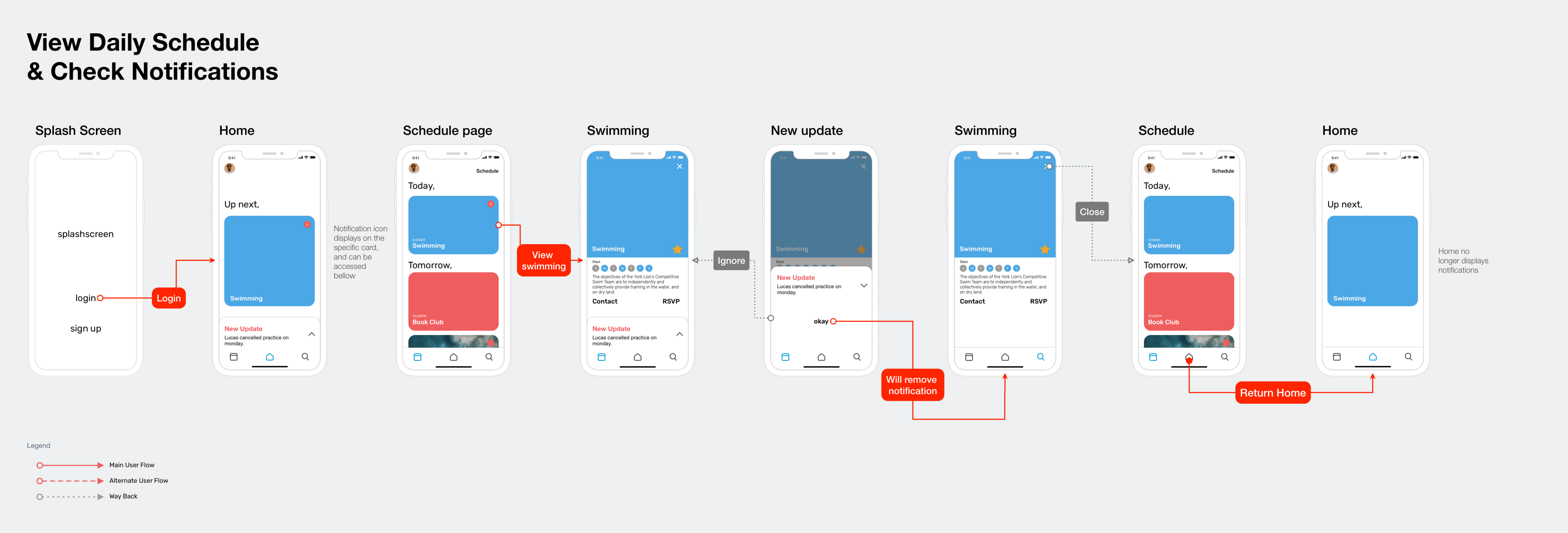
View Daily Schedule & Check Notification
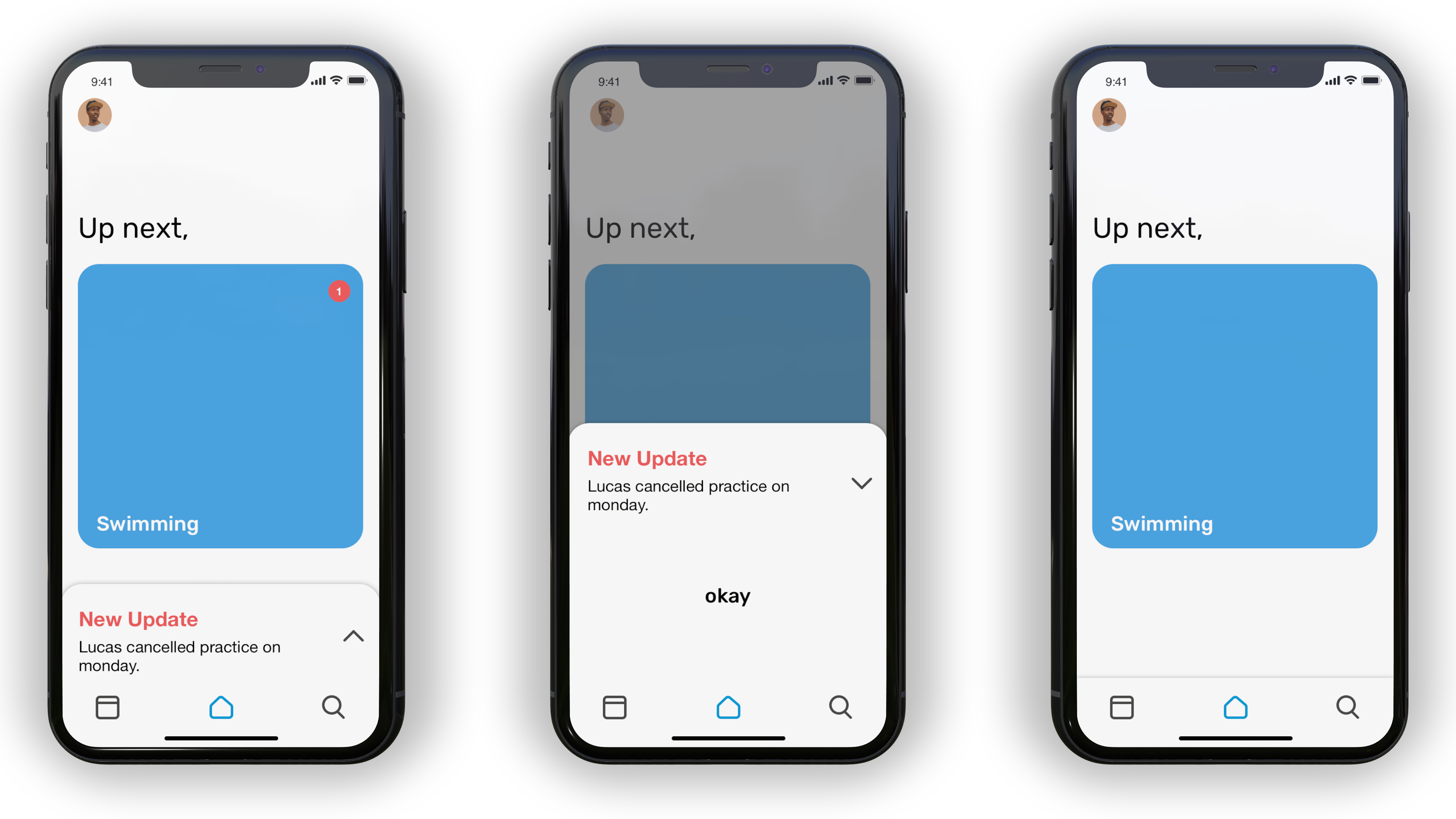
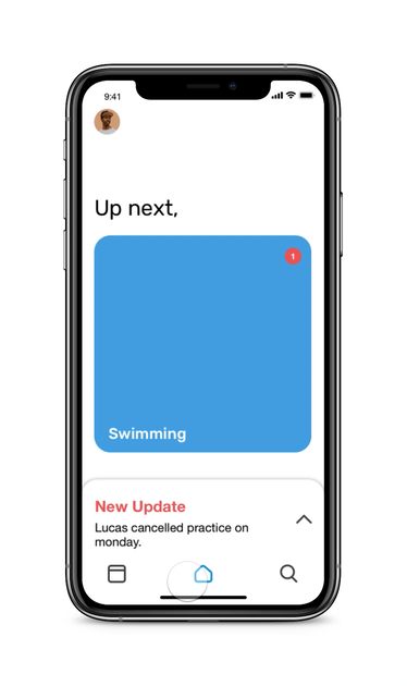
To stay on track with his schedule, Tyler likes to view his daily schedule, he sees that he has notifications from the swim team and checks it so he can stay on top of things.
Step eight
Future Plans
Based on the information I received from my user testing, I have discovered additional features that can be useful to implement in future versions of my application. In the next version, I will focus on adding a discussion board to each of the organizations the user is apart of. This version of the app just scratches the surface with notifications, but a chat could be added as well as a friends feature where you can invite and make friends right in the app. This could be connected with facebook friends. This would be important to implement because making new friends is always tough for new students, so if they were able to interact with these people right on the app it would make finding friends a lot easier.
Step nine
What I learned
This project from start to finish was so much fun to do! Knowing that I only had seven days to complete the project, I had to prioritize which parts of the product I really wanted to focus on. I learned how to take a very broad project brief and break it down to fully understand more important components. With this, I was capable of making sure my application will actually work and be useful for the targeted students. With no direction other than this brief, I was aware that I had to remain focused and keep to what I knew about UX design throughout the project.
My biggest takeaway from this project was to do my process and my research in steps and to ensure that I actually followed those steps accordingly. Typically, when assigned to a project, I would jump right in and start designing. However, with this project, I was given very little information and I had to come up with my own problems and solutions. In the end, this made designing the actual app so much easier. It helped me along the way because as I designed I could refer to my research and my process which kept me focused and on track.