YSDN Hackathon
Launch Prototype
Role
User Interface Design, User Experience, Prototyping, User Research, Project Management
Timeline
24 hours
Team
Alex Blechta, Jasmine Acebes
Tools Used
Sketch, Adobe Illustrator, InVision
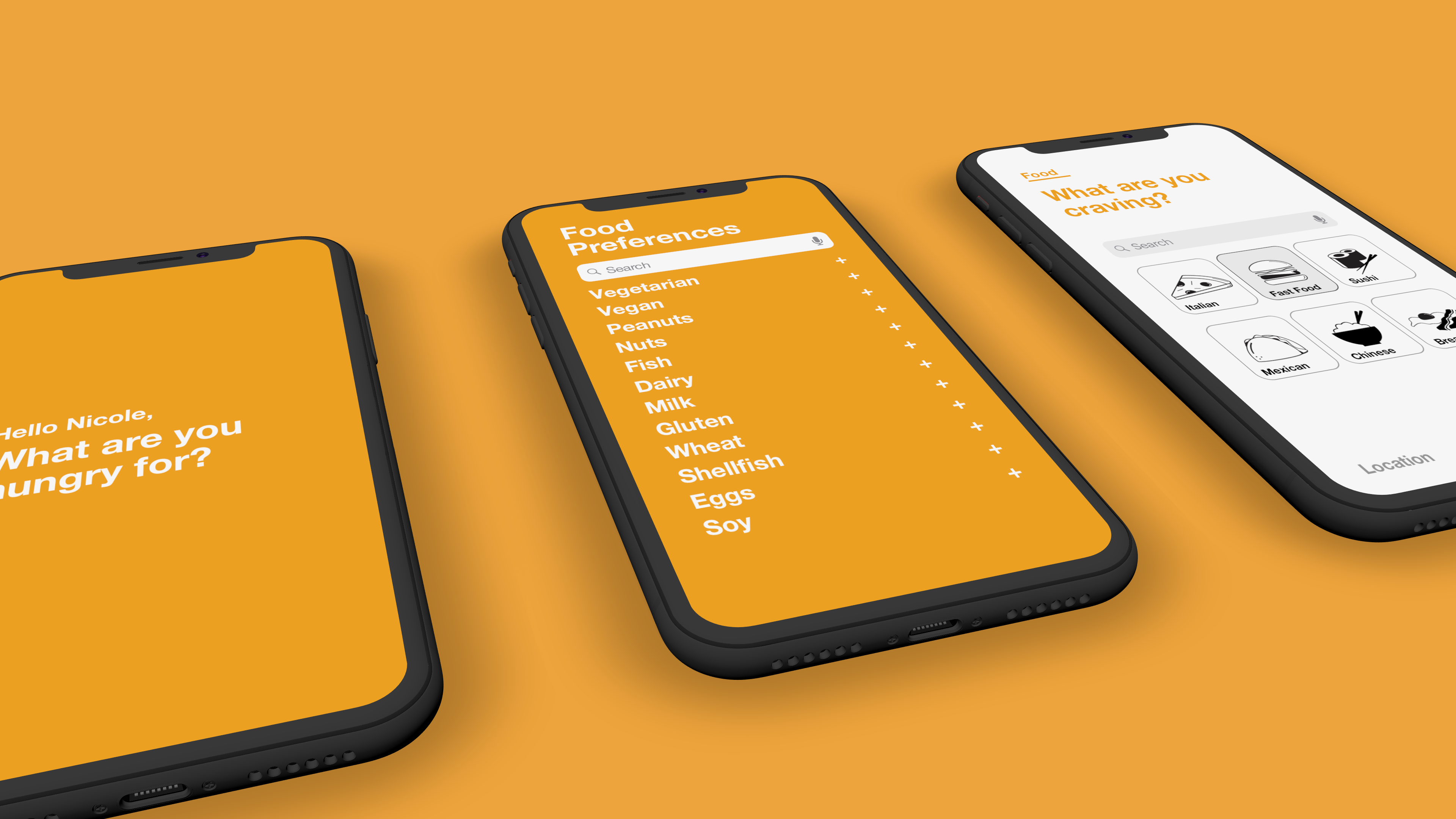
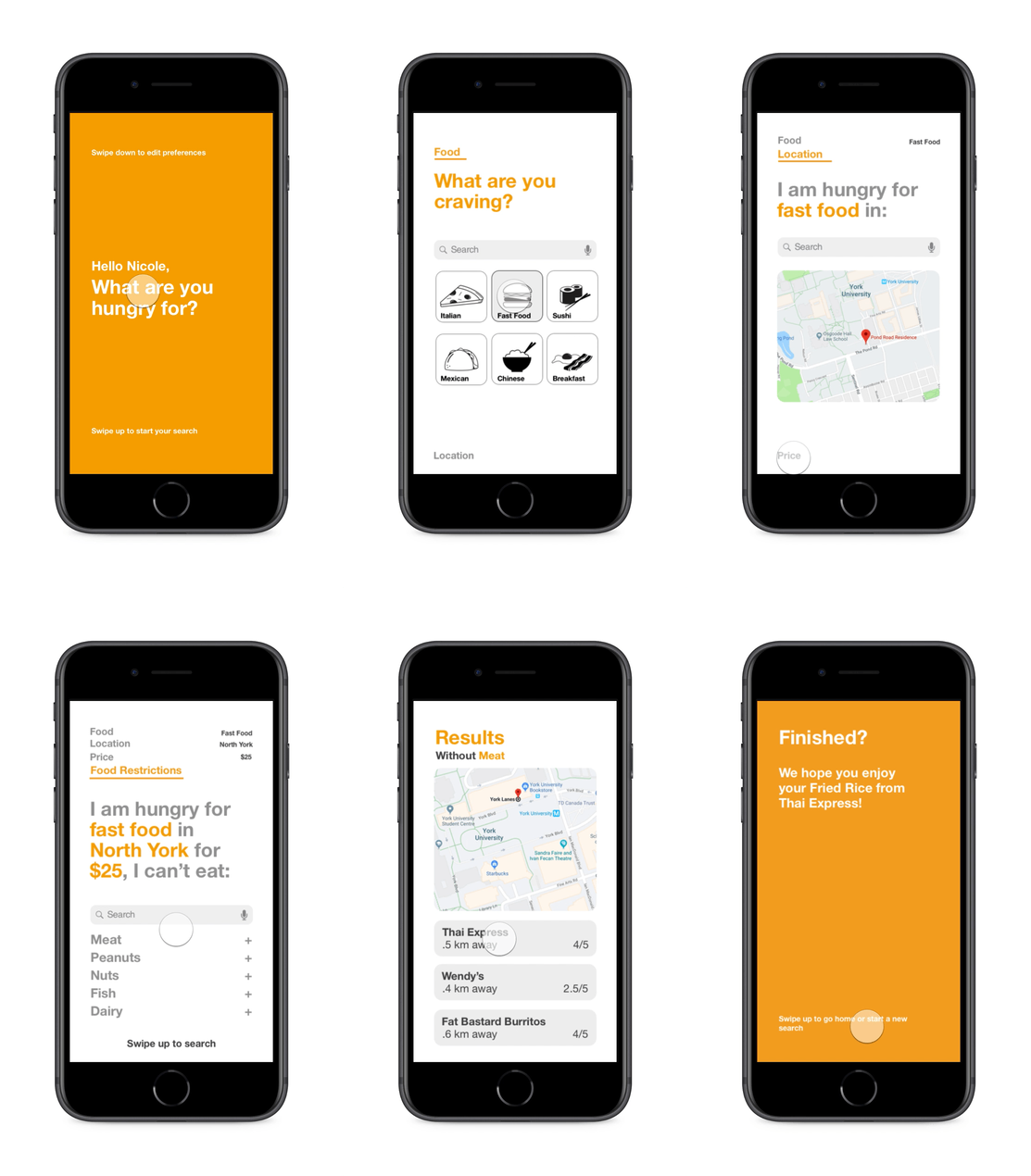
This prototype was designed to help people who have food restrictions easily find restaurants that can accommodate them. The apps navigation is all done through either swiping up or down, this allows the app to maintain its minimalistic qualities.
Step one
Identifying the Problem
The purpose of this app is to help people who have food restrictions easily find restaurants that support those resctrictions. Usually those that have food restrictions often find it harder to go out to eat, so this application will enable users to have all the information on hand instead of searching multiple sites.
And along came our design challenge....
With 24 hours we had to bridge the gap between people with dietary restrictions and resturant menus.
Step two
Proposing a Solution
The purpose of this app is to help people who have food restrictions easily find restaurants that support those resctrictions. Usually those that have food restrictions often find it harder to go out to eat, so this application will enable users to have all the information on hand instead of searching multiple sites. Potential benefits would be less time wasted for users that are searching multiple restaurant websites to find potential menu items. Also, this would make people who are following specific diets to be more inclined to stick with their goals since it is less of a hassle to eat out.

Step three
Identify the User
The target audience would be anyone who is living with a dietary restriction. These restrictions could either be alergies, a diet, or by choice. The user struggles daily to find resutrants that adapt to their lifestyle.
Step four
Create a Persona
Your name is Nicole Hall, a vegetarian living at York University. A daily struggle you run into is being able to find healthy vegetarian food around campus.
Step five
Establish a Focus
Interface must be simpleStep six
Consider the Competition
Restaurant-based applications such as Yelp! and Skip the Dishes have a similar goal, however our application is more accessible to dietary restrictions than the others that aim at the general public. Also, in the US there is a website called AllergyEats.com has a similar concept, but the design is not as strong, and there is a minimal amount of allergy restriction options.
Swipe down
Accessing your profile
Nicole would like to access her profile, so she swipes down. From here she can edit her food preferences which will save and apply to all future searches.
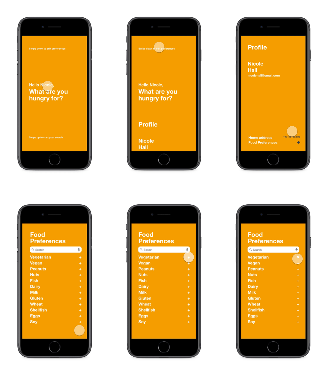
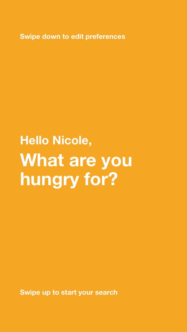
Home
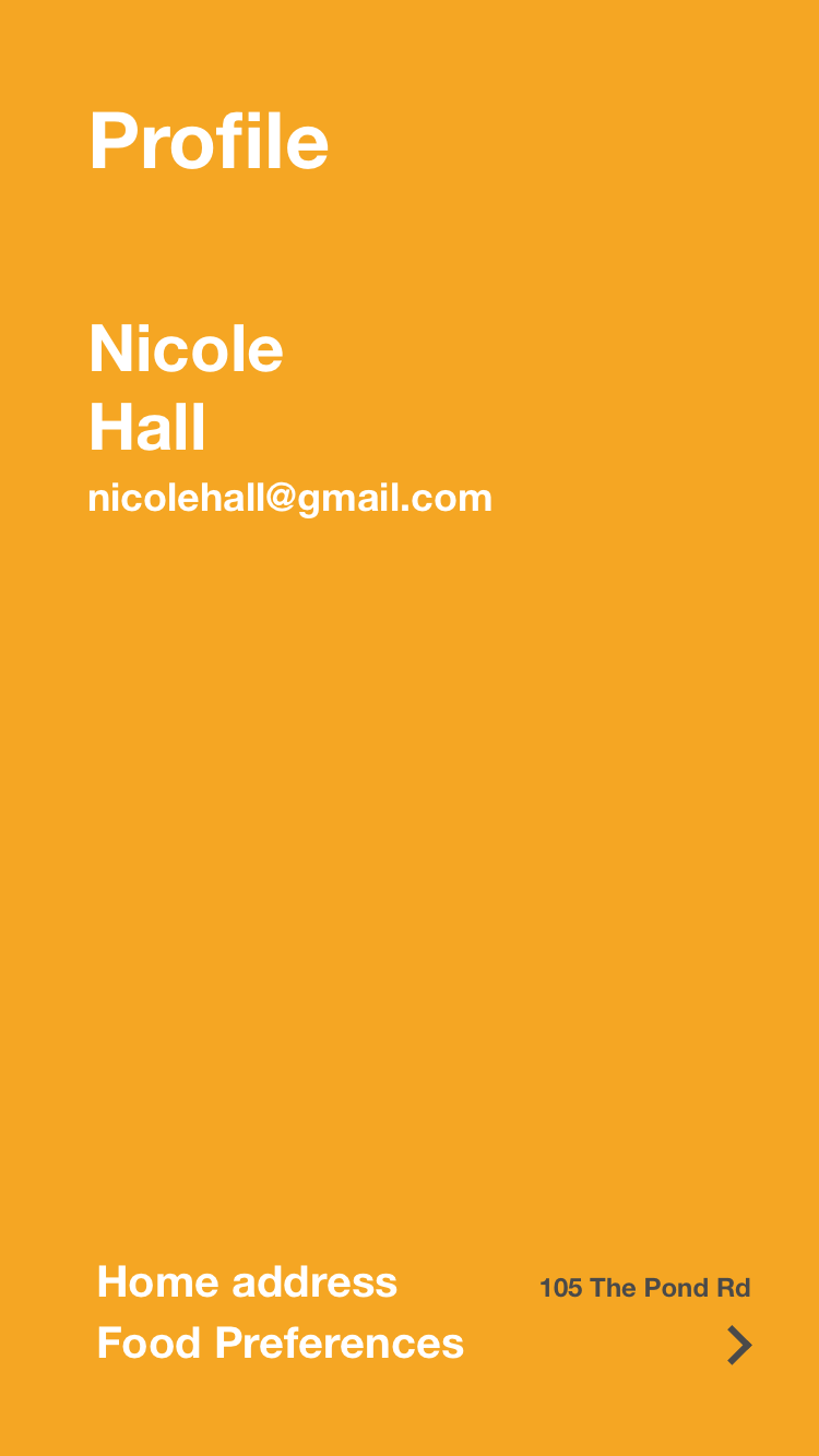
Profile
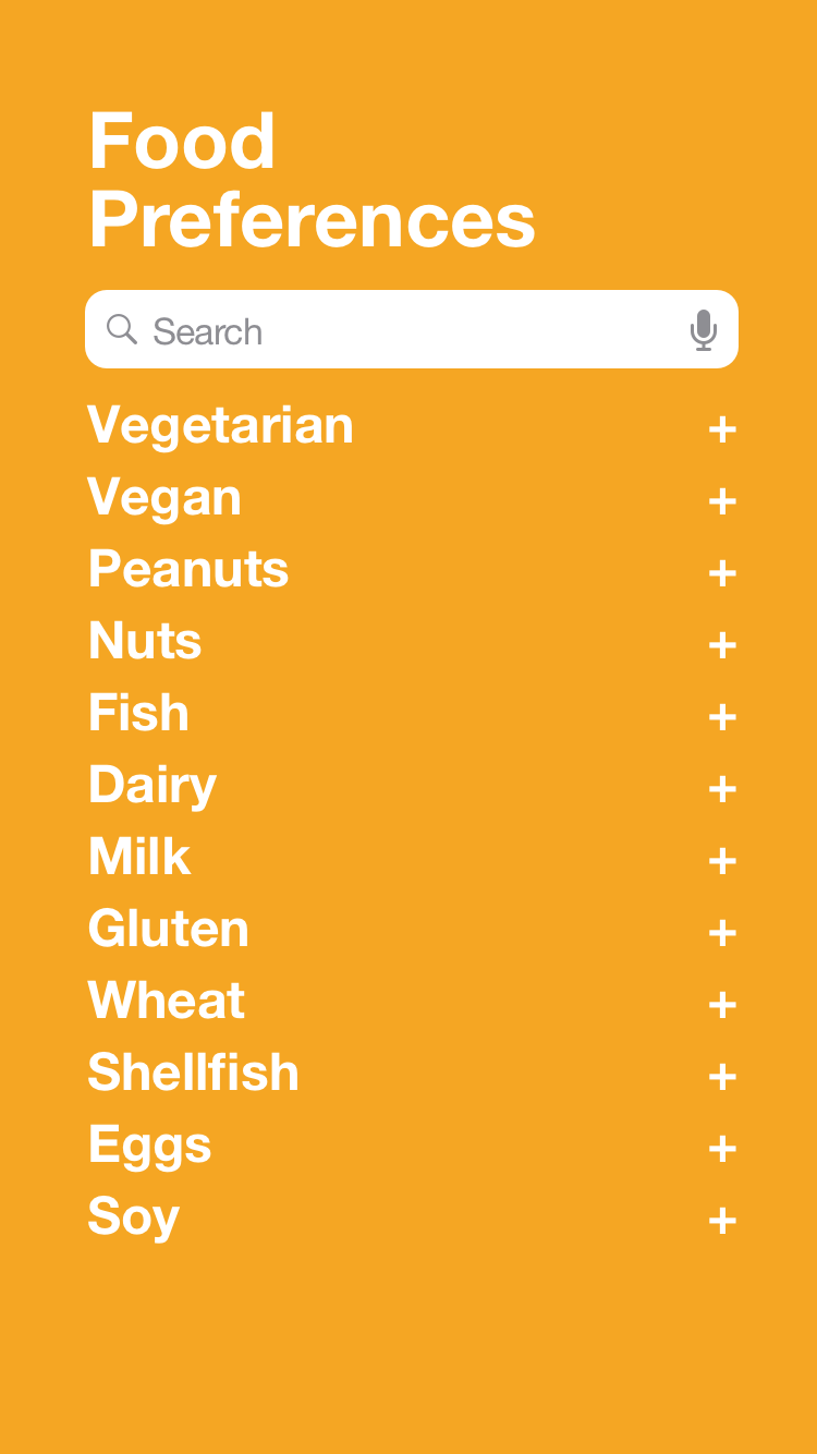
Food Preferences
Swipe up
Search
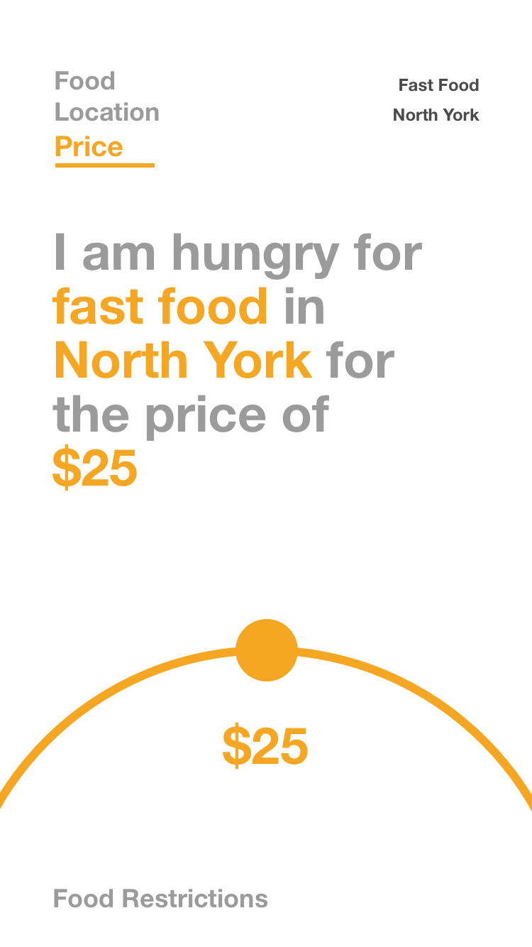
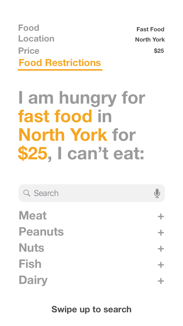
Nicole is hungry for some fast food in North York, so she swipes up to start a search. As she adds to her search criteria the app creates a dialog search. Foodie then displays resturants with menus that pertain to her food restrictions, and only shows those items.
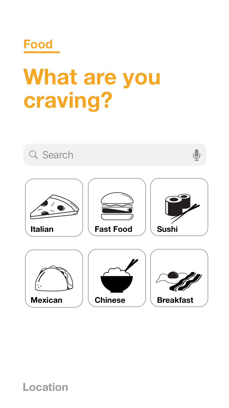
Food
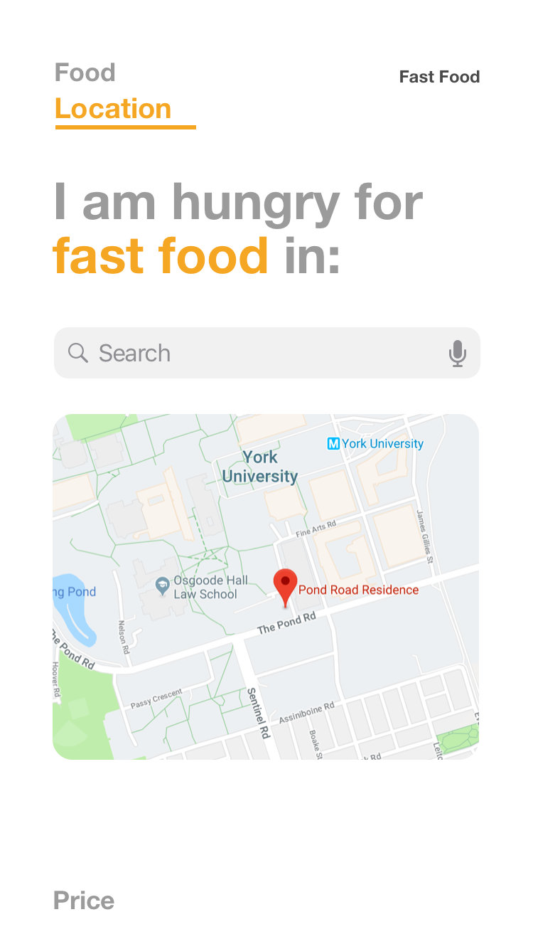
Location
Price
Food Restrictions
Step seven
What I learned
This hackathon really tested me, having only 24 hours to create a working prototype with another designer was something I have never done before. Staying focused and on track with this project was essential in order to get everything done. I learned how important collaborating with other designers was, for this we mentioned our strengths and we each assigned ourselves different tasks based on those strengths.